<img height="1" width="1" style="display:none" src="https://www.facebook.com/tr?id=262721675103356&amp;ev=PageView&amp;noscript=1">

5 min read

UX Design and Usability in Web Forms

When a person enters your website, they have a specific objective, be it to obtain information, resources, buy a product, among others. Most of the times to achieve this objective, a form must be filled out, however, this will never be the main objective of the user, but on the contrary it is usually a step that is not necessarily to your liking.

Therefore, it is important that this process is optimized in order to effectively collect the information. Although the forms can become tedious for customers, they are necessary for the company to collect their information, for example, in the Inbound Marketing methodology, obtaining the email of the people who enter the website, it is very important to be able to take them through the entire Buyer Journey and generate conversions with this.

Now, the methodology tells us to offer valuable content to the person in exchange for leaving us their data and how we collect this, through a form, however, the form as such should not mean an obstacle, because If it is confusing, very long or does not generate trust, no matter how much value is offered, the user experience will be affected and it is most likely that they will leave the page and go to others, remember that in this digital world, everything is a click away.

Now, the big question is, how do we manage to optimize web forms so that people do not leave our website in the last step and if we can generate conversions? The solution is quite simple, make forms thinking about the user experience (UX) and in usability. Here I am going to leave certain points that should be considered to offer a usable web form and that provides a better user experience.

First, we must understand what are the common elements that forms have and how each of them should be optimized:

1. Structure:

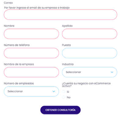
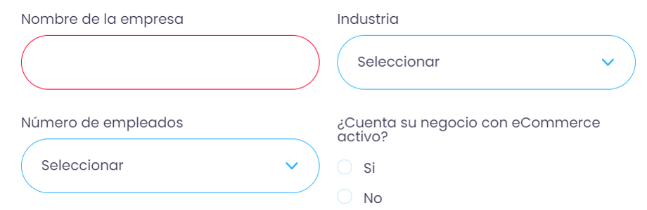
This refers to how the fields are organized, the logical connections that exist between the elements, and the overall layout of the form. Therefore, here are some tips to consider so that the structure is understood by the user and he can complete it correctly.

FORMS

Tips:

  • Don’t ask too much: First you must establish how and for what the information you collect will be used, so you make sure to ask only what you really need so as not to make the form too long, this will prevent the client from feeling overwhelmed, not only For the length, but because if there are many questions, people may not want or know how to answer and will only end up leaving the site.
  • Order the questions correctly: A common and logical order should be followed when ordering the questions, thanks to this the process will be facilitated for the user when filling it out, thus making the visualization familiar. For example, we will hardly ever see the phone number asked before the name.
  • Group the information: Generating groups within your form will help the user to understand more easily what information to put, for example, generate groups with personal data, company data, among others.
  • Number of columns: It is best to use a single column to make a form, since reading it will be faster, if two columns are to be used, many more elements must be considered so that understanding the flow does not become an obstacle read or slow down the process.

    2. Fields to fill

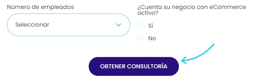
They are the fields where the user must fill in their data, this includes text boxes, checkboxes, radio-buttons, selection boxes, passwords, among others.

Campos

Tips:

  • Minimize the number of fields: When a person sees a very long form or with many fields to fill in, it is most likely that they will not fill it out, that is why the information requested should be limited, but not only that, but that also joining fields is a good strategy so that visually it looks much less heavy. For example, to select a date, instead of putting 3 fields with the day, month and year, you only need to put a field with access to a calendar.
  • Avoid optional fields: If they are optional fields, it means that it is not information of such high relevance or that people are uncomfortable answering, and many times an optional field can cause a person to leave the form, without realizing that it was optional, so if you are going to use them make sure to identify them clearly, so there is no confusion.
  • Fields with predefined options: In many cases there will be fields where it is better to give predefined options, since it will help people to complete the form and to keep the order in your database because it limits the amount of options that people can put.
  • Indicate the current field: By clearly indicating to the user the field that is currently selected, you will avoid confusion and fill a field in the wrong way.

    3. Field label

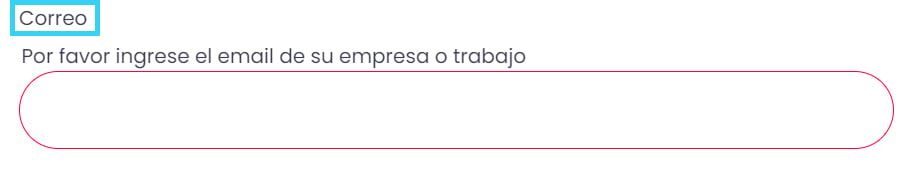
They are those texts where it is specified what information should be put in each of the fields. A clear label will facilitate the process for the user.

etiqueta

Tips:

  • Short expressions: Short and descriptive expressions allow the client to quickly visualize what information to fill out.
  • Place the labels correctly: The best location of the labels will be above the fields, since it follows the reading flow, so users will be able to visualize the information more quickly, however, placing them to the left of the fields can be beneficial if we want the fields to be reviewed more carefully, none of these will generate confusion for the user.
  • Labels outside the field: It is best to use labels outside the writing field, since when it is positioned to start writing, users can lose sight of what information they should fill in that space and make mistakes.

    4. Buttons

They are the CTAs of the form, from when the user clicks on it, the process is completed or the process continues, that is why they are an important element.

cta

Tips:

  • Define the visual aspect: It is important that the button looks like such, in addition to generating some feedback so that the user knows when it is passed over and when it is clicked. Remember that a button should always draw attention to the rest of the elements since, in the end, it is the one that completes a process.
  • Take care of the position: The button must be located at the end since it is the last step to execute when filling out a form, also there should not be much space between the form and the button, because the objective is that it is clicked right after to finish filling out the form.
  • Do not use generic names: When using generic names it gives a feeling that the whole form is, also it does not describe well to the user that he is going to get when he clicks it, so it is best to specify more clearly what he is going to get, for example , Get template, Subscribe to blog, among others.
  • A main button: There must be a single main button that is the one that will complete the filling of the form and is the one that will fulfill our main objective, if you want to put a button to return, to delete or another, they must have a lower hierarchy.

    5. Feedback

These are some messages that appear in the forms, when something was completed or sent correctly, also when something is incorrect it notifies you and clarifies what the error is and gives a possible solution.
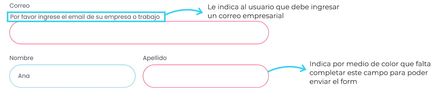
retroalimentación

Tips:

  • Take advantage of color codes: Using green to indicate that the information completed is correct or red for the opposite, yellow to indicate that a password is weak is an easy way to quickly communicate the status of their actions to the user, The best thing is to validate the fields as the form is filled in so that it is easier for the user to correct immediately and not have to return to review.
  • Visible help button: If you are going to add a help button in any field to explain to the user more clearly the information to be completed, it is best that it be highly visible so that you can really achieve your goal.
  • Indicate errors: When there is an error when filling in the form, it is recommended to specifically indicate to the user what the error is, so that it can be easily solved.


Web forms are necessary so that companies can obtain information from their clients, however, for users it is only a cumbersome step to reach their real goal, therefore the importance of generating forms with which interaction is as easy possible. Using the tips that we have exposed to you previously, you will be able to increase the usability of the forms and with this improve the user experience of your website and increase the number of conversions.

Good luck improving your web forms, if you want to learn more about web forms and landing page optimization, click the button below. Meta description: Obtaining customer data is very valuable so optimizing your web forms with UX design is essential.

Suggested Insights For You

Smarketing: Tips to align Marketing and Sales

Smarketing: Tips to align Marketing and Sales

Traditionally, most areas within organizations have operated as independent entities. Additionally, the changes that the world market is...

Read More
Customer Journey Map: What it is and how to create one?

Customer Journey Map: What it is and how to create one?

Have you ever thought that the process of your purchase or of any person implies a previous process until you make or carry out the transaction?

Read More
Essential Foundations for Integrating Apps in HubSpot

Essential Foundations for Integrating Apps in HubSpot

Discover the essential fundamentals for integrating apps in HubSpot. Define the step-by-step objectives and parameters of your integration projects.

Read More

ICX SUBSCRIPTION

Come and be part of the latest specific insights provided by our experts

What’s next?

ARE YOU READY?